
.jpeg)
If you’ve been using a Roku player or smart TV over the past year or so, you’ve probably noticed some big changes on the home screen.
What used to be a straightforward grid for all your installed apps has now become a mishmash of menu options, shortcuts, and content recommendations. While you can still simplify the Roku home screen with some settings tweaks, the trend is clearly toward stuffing it with content that makes Roku money.
So here’s my counterproposal: Instead of keeping up the pretense of a simple home screen, Roku should just toss it in favor of something more useful. In fact, Roku already has a perfectly good starting point lurking in a different part of its menu system.
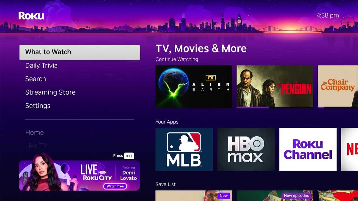 you access Roku’s What to Watch menu from the left-hand sidebar.
Jared Newman / Foundry
Click over to Roku’s left-hand sidebar menu and you’ll see a “What to Watch” section among the increasingly numerous options (which themselves are partially obscured nowadays by a banner ad).
When Roku added the Watch to Watch section in 2022, it wasn’t all that useful. Mostly, it was just a way for Roku to recommend more ad-supported content, both from its own Roku Channel and other free, ad-supported streaming sources.
Over time, though, What to Watch has improved in a few notable ways:
- The Continue Watching row lets you quickly resume what you’ve been watching from across different streaming services, including Netflix, HBO Max, Hulu, Disney+, and Peacock.
- You can bookmark movies and shows for later—either from search or other parts of Roku’s menu system—by adding them to a Save List that appears in the What to Watch menu as well.
- The Your Apps row at the top of the screen lets you jump directly into apps you’ve already installed on your Roku device.
What we have, in other words, is a nearly complete menu system. From a single screen, you can launch apps, pick up where you left off, and discover new things to watch. It’s also arranged in a way that actually benefits users, with content they’re watching and saving prioritized over anything promotional.
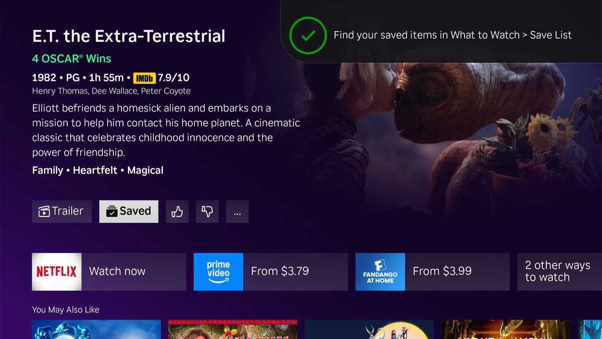
Roku’s Save List is a great feature, but saved items only appear in the What to Watch menu, not on your home screen.
Jared Newman / Foundry
If it were up to me, I would simply make this What to Watch menu the default Roku screen, perhaps fleshing it out with quick links to Roku’s live TV and Sports menus. The layout is very much in line with what most other streaming platforms offer today, although Roku’s version is simpler and cleaner than the likes of Google TV and Amazon Fire TV.
Roku needn’t ditch the app grid entirely. Instead, it should give the What to Watch section an All Apps button at very front of the Your Apps row, and have it link to a straightforward list of apps, without all the cruft that Roku has been adding lately. By defaulting to a richer and more useful content hub, Roku can free up the app grid to serve its original purpose.
Why won’t Roku do this?
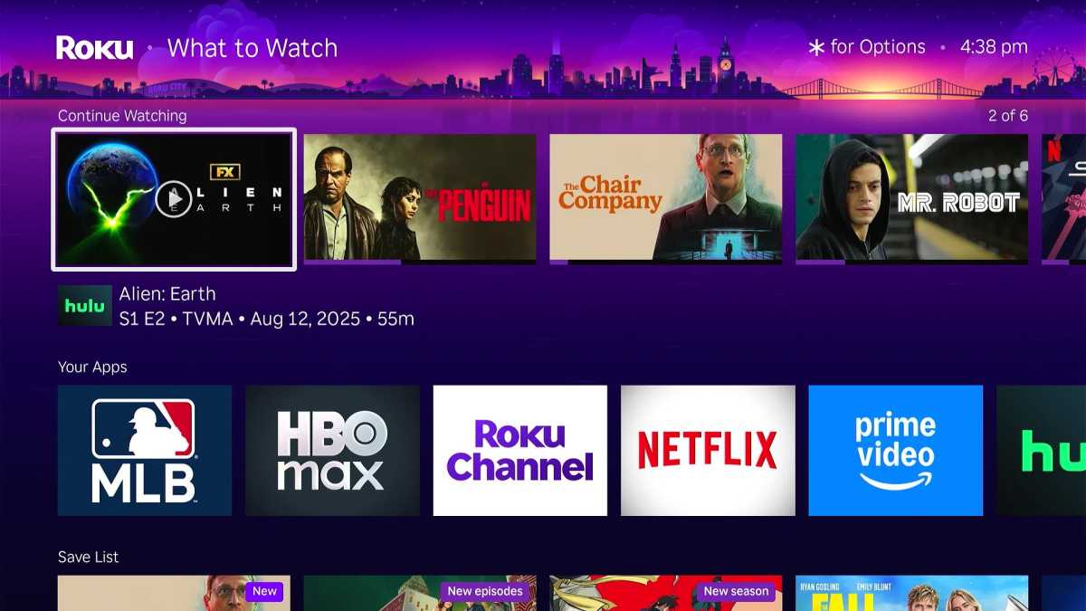 Everything you need in one place, including shows-in-progress, recent apps, and saved items.
Jared Newman / Foundry
Part of me was hoping Roku would announce this kind of home screen shake-up as part of its fall software announcements earlier this week. Instead, the company announced some more modest updates, including a new AI-powered voice assistant and a way to tune your home-screen recommendations.
I’m not too surprised. The company tends to be conservative with software changes, and the app grid has always been a defining Roku feature. Throwing it out or making it less prominent might confuse some users and invite a backlash.
Still, Roku could easily mitigate this by letting users choose their default home screen. Keep the app grid by default for existing users, but let those of us in the know switch to the What to Watch menu instead. Over time Roku could move new users over to the Watch to Watch menu and present a choice to existing users as they set up additional smart TVs or streaming players.
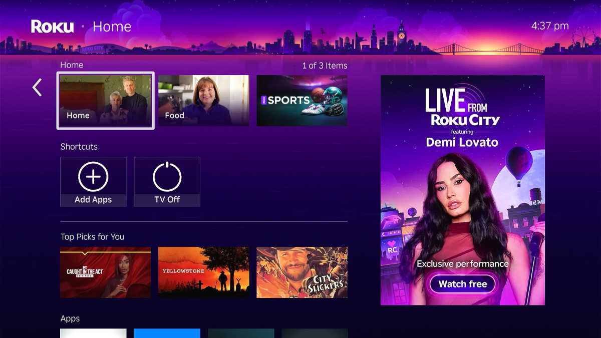 Roku’s Home screen, now filled with junk.
Jared Newman / Foundry
It’s not as if the app grid is sacrosanct for Roku. The addition of recommendation tiles, genre-based menu options, and shortcuts show that Roku itself wants to get away from the app paradigm and make its home screen more content-forward. Doing so helps serve Roku’s business goals of upselling subscriptions through its billing system and promoting ad-supported content.
But Roku already has a better version of that idea elsewhere in its menu system, one that’s also more useful for its users. With the What to Watch menu providing a better launch experience, Roku should stop patching up the home screen with Band-Aid measures and finally perform the necessary surgery.
And sign up for Jared’s Cord Cutter Weekly newsletter for more streaming TV insights.
Author: Jared Newman, Contributor

Jared has been a freelance technology journalist for more than 15 years and is a regular contributor to PCWorld, Fast Company, and TechHive, where he's written a weekly cord-cutting column since 2014. His Cord Cutter Weekly newsletter has more than 30,000 subscribers, and his Advisorator tech advice newsletter is read by nearly 10,000 people each week. Jared has a master's degree in journalism from NYU and specializes in making complex tech topics easy to understand, from streaming and cord-cutting to neat apps and useful tech tricks. He is based in Cincinnati, OH.


 English (US) ·